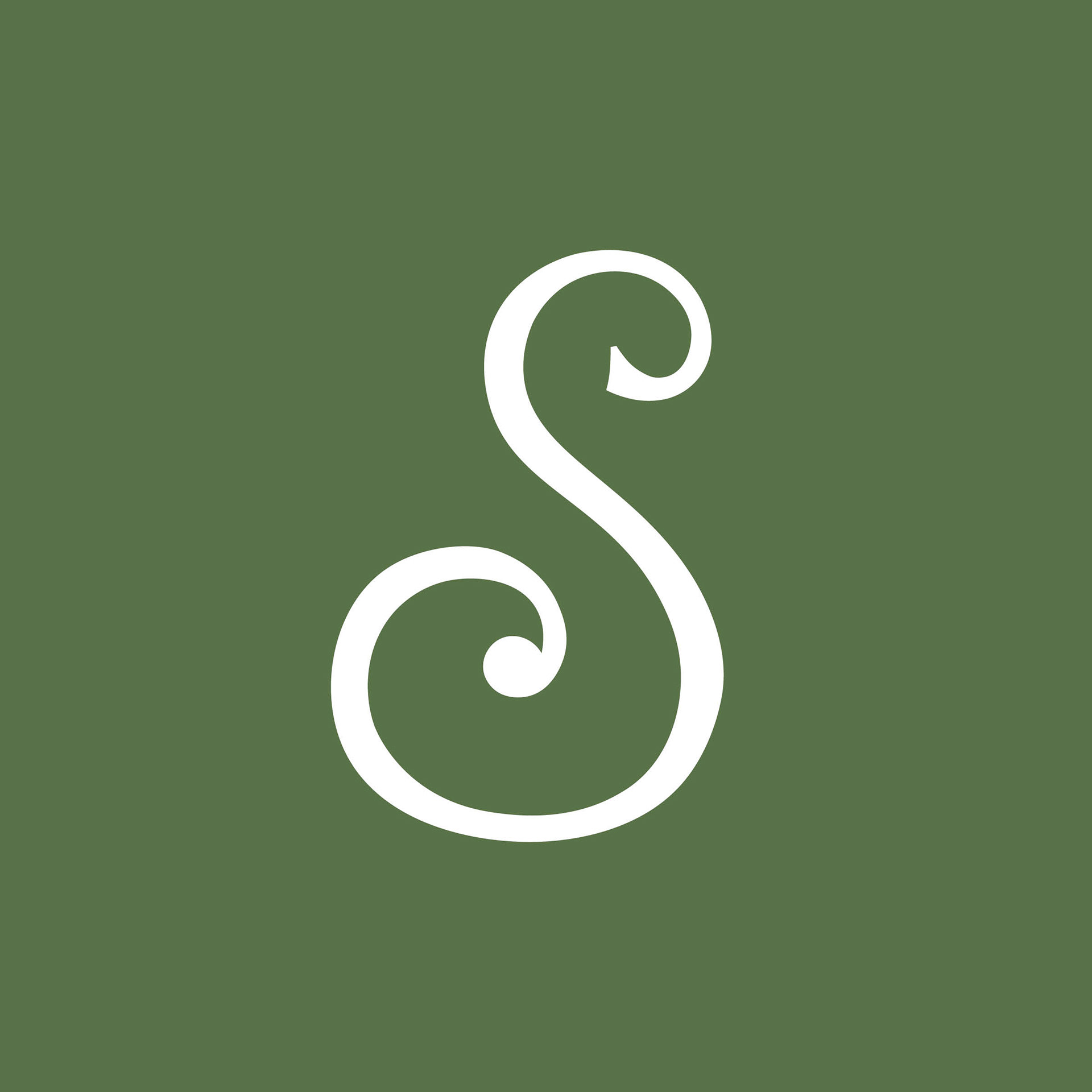
Brief: Design a typographic poster using a single typeface to advertise the city of Savannah, Georgia. Create a custom letter design that represents the city.
This project began by researching everything about the city from its history to its natural features, modern attractions, and industries. Based on the research I selected Optima as the typeface. Savannah really blends historical and modern styles in a way I felt Optima reflected very well.
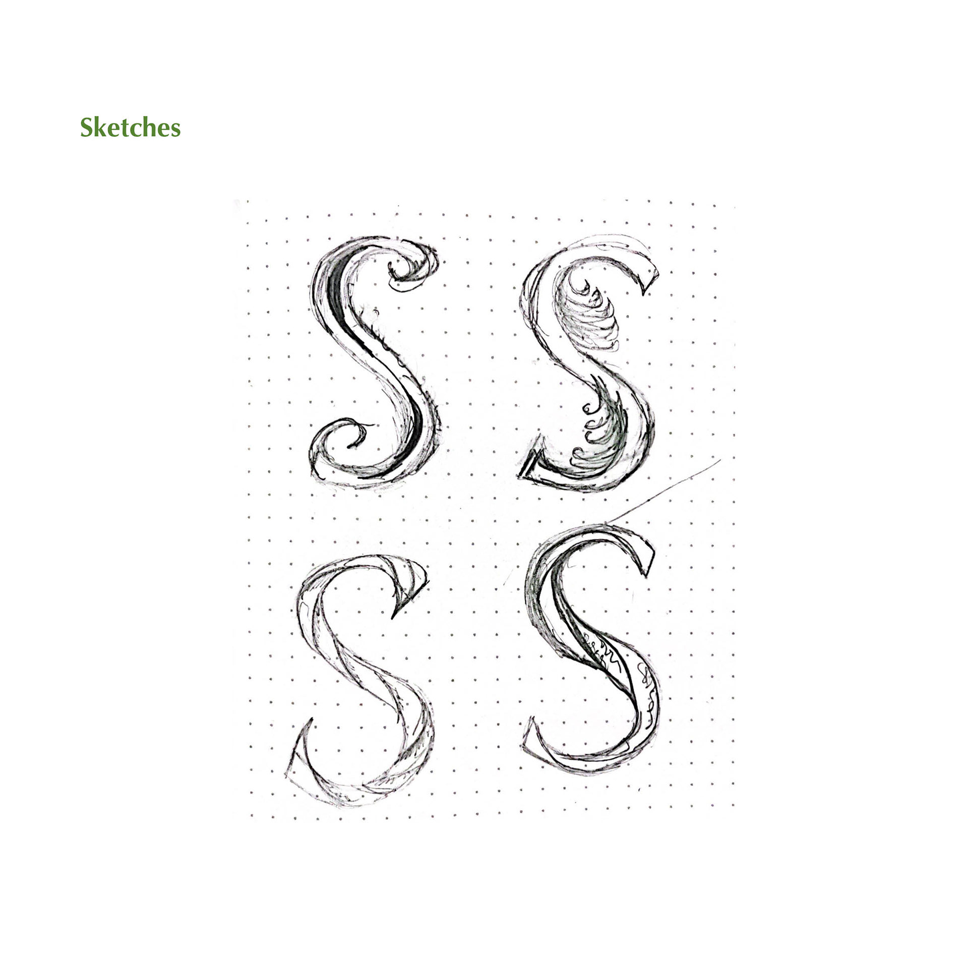
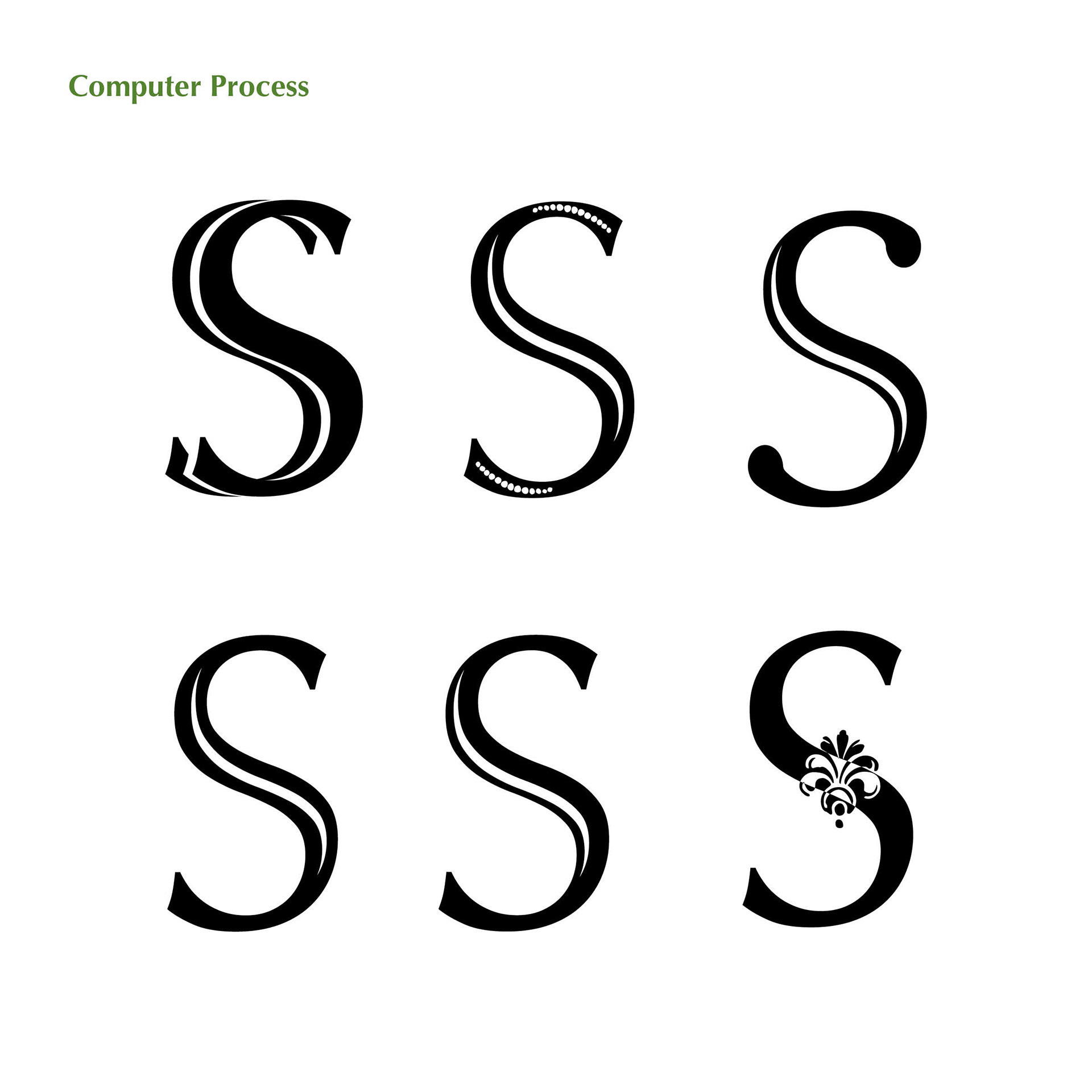
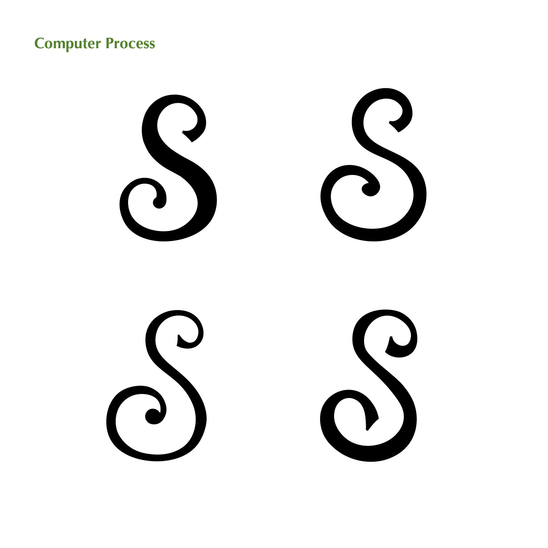
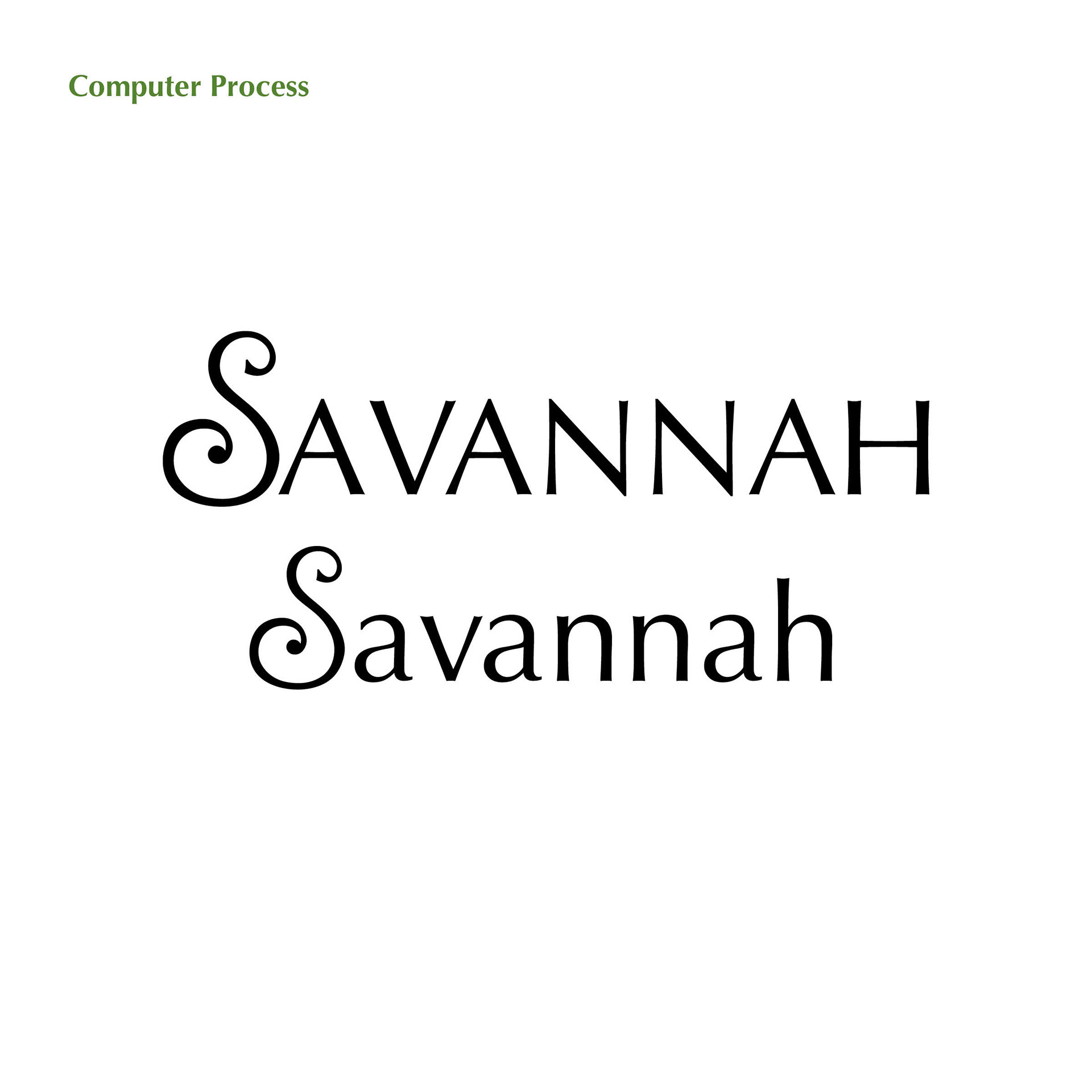
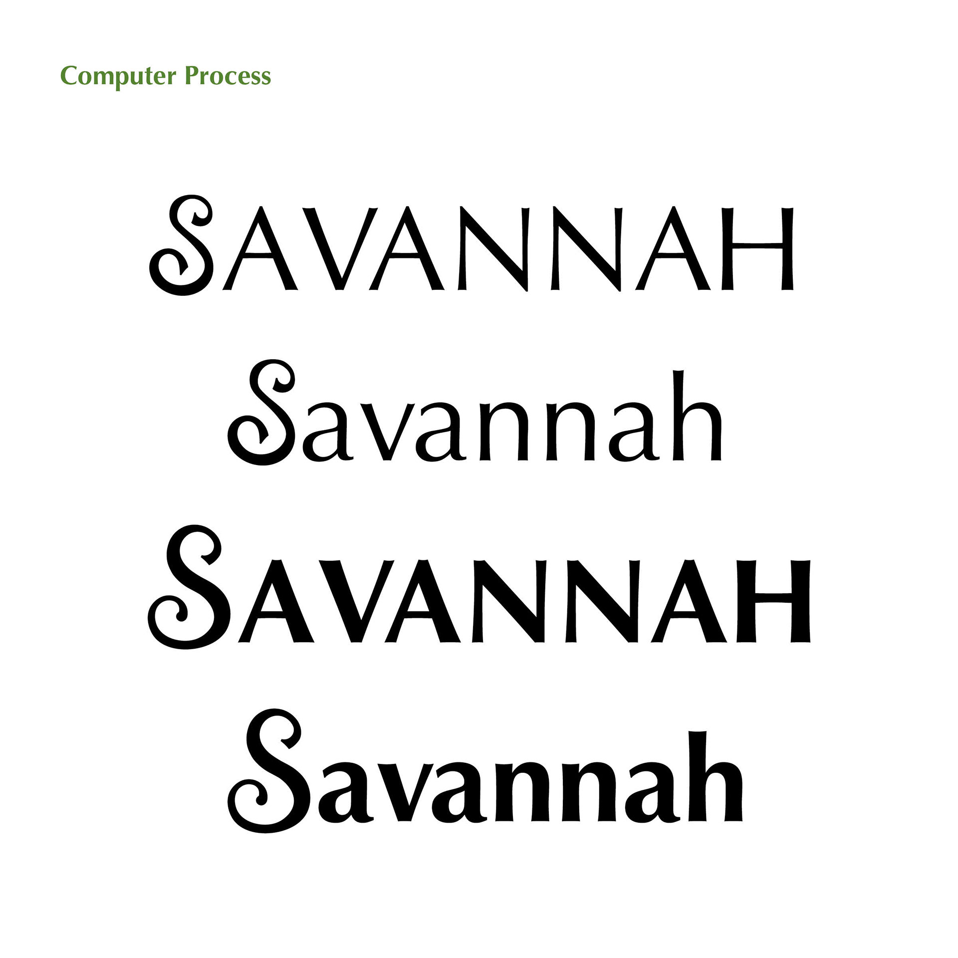
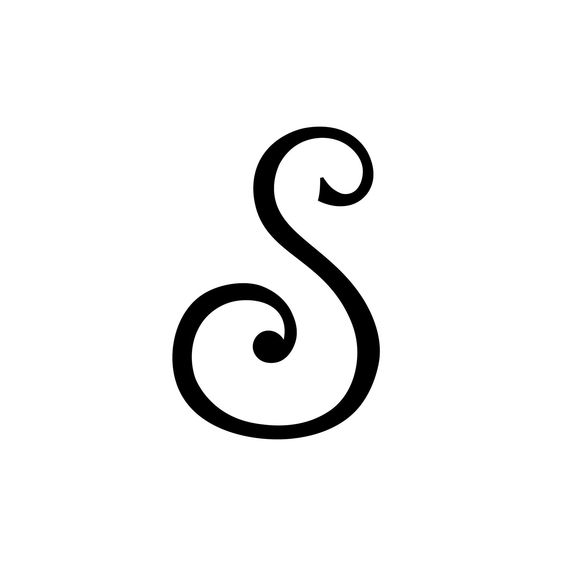
Letterform Design
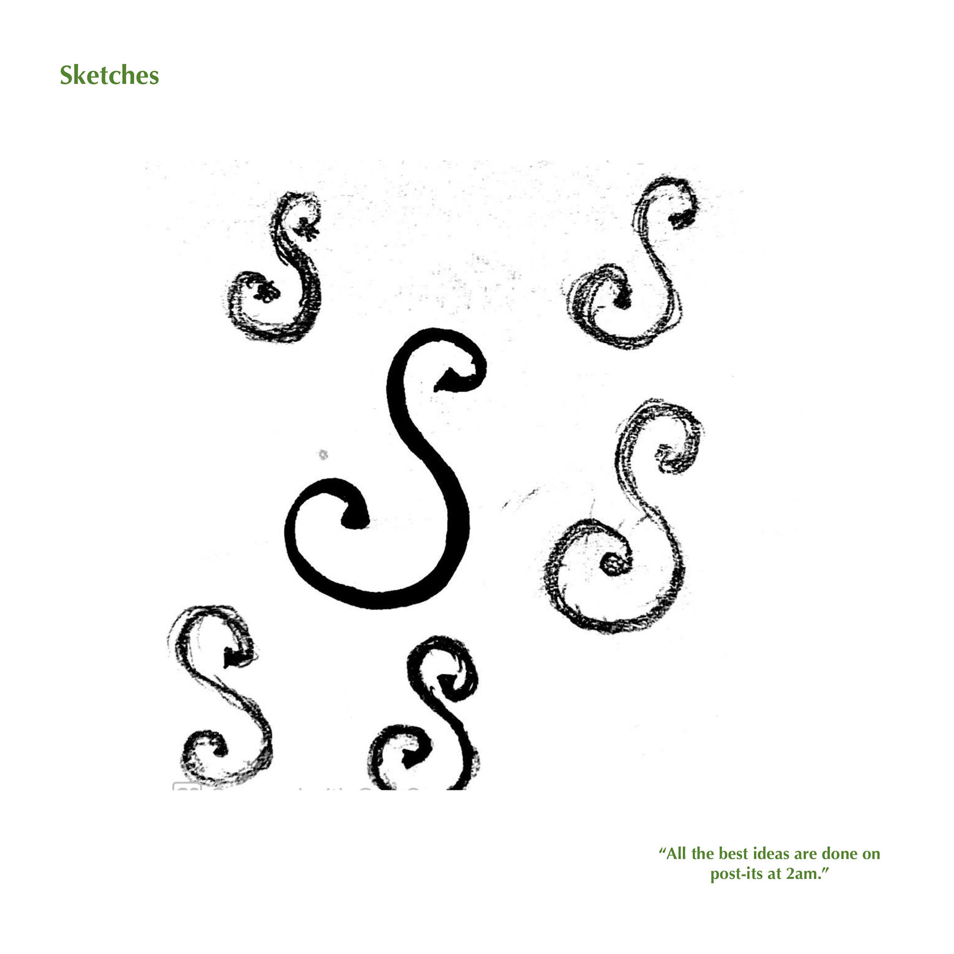
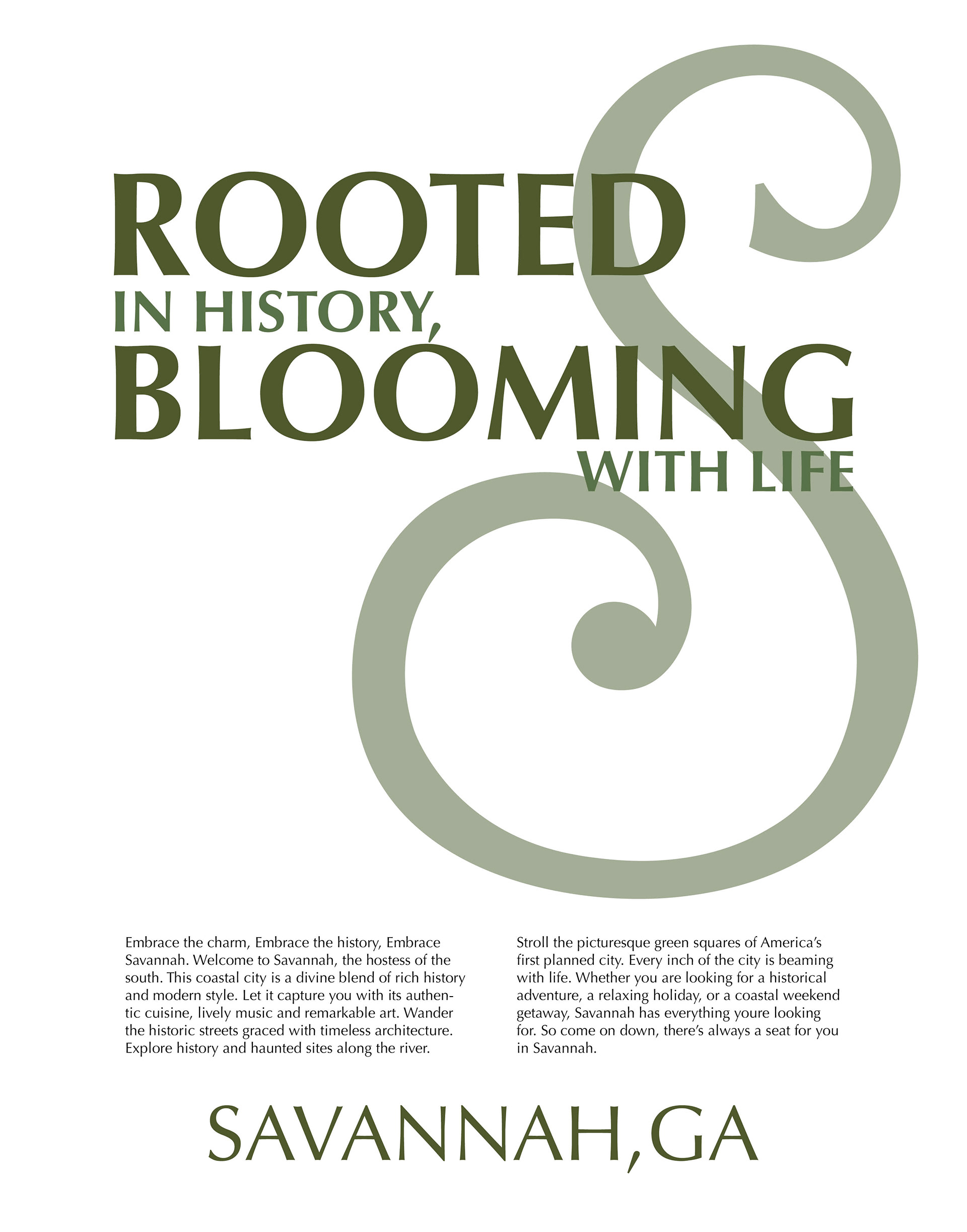
When it came to the letterform I really wanted something reminiscent of the ironwork railings seen on the historical homes in Savannah.
In my head, I knew exactly how I wanted it to feel but I just wasn't there yet. Then like all the best ideas, it finally hit the paper on a sticky note in the middle of the night. Having the more squared-off terminal on one side and the soft round one on the other showcases the balance of old and new that makes Savannah so unique.
Copywriting
Copywriting was an unexpected joy for me. It's something I hadn't really ever explored but sitting down and brainstorming ideas with my classmates was one of my favorite things.
Working with my peers through the creative process and bouncing ideas off each other was so inspiring for me.
Coming up with a headline and playing with different alliterations and double meanings was a lot of fun. With this headline, I really wanted to tie in the old history of the city with the natural scenery and beauty of the area while keeping it playful and intriguing.
"Rooted in History.
Blooming with Life."
Poster Design Process
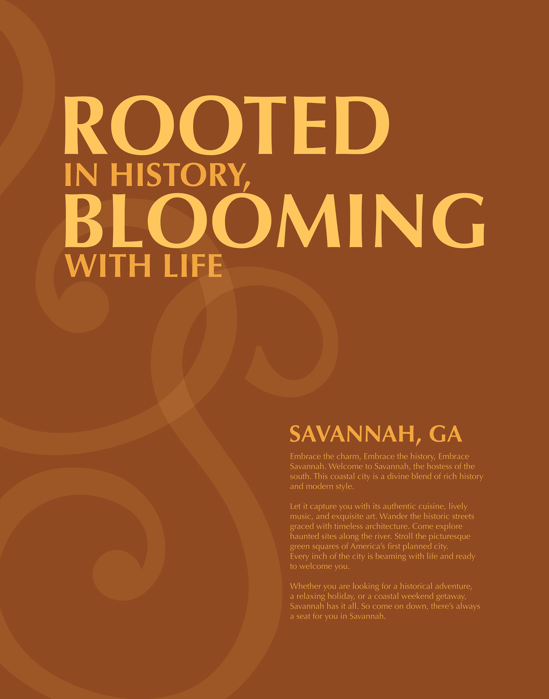
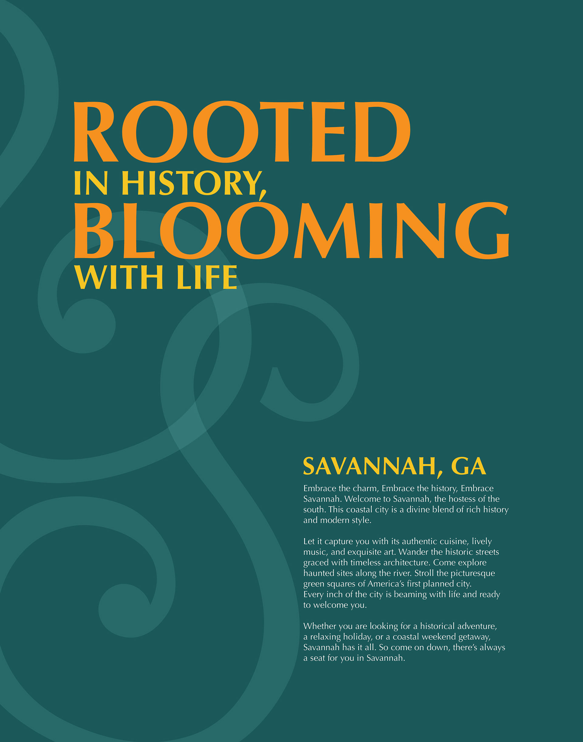
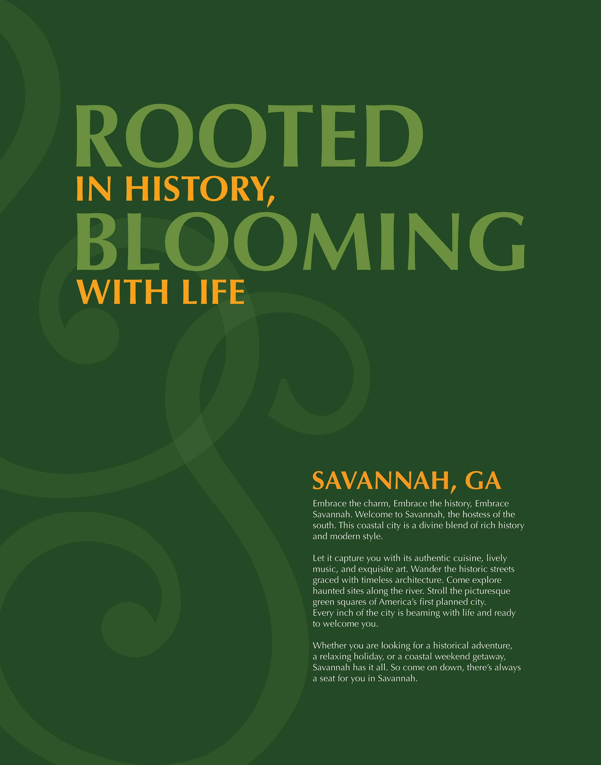
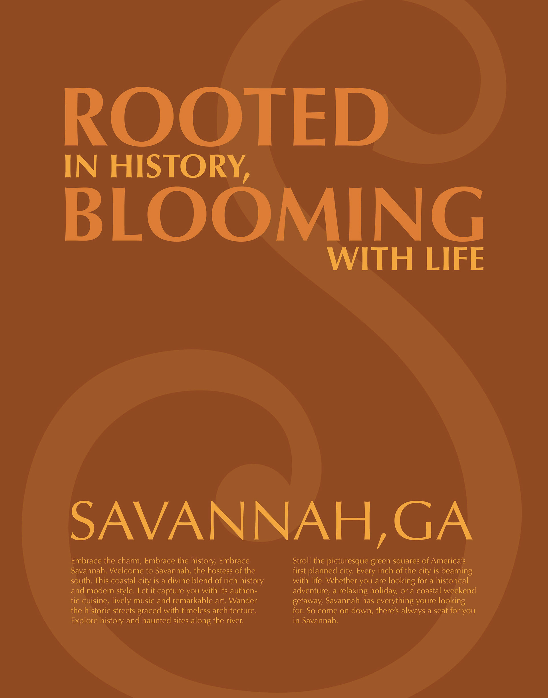
Initially, I wanted to capture the warm southern feel of Savannah with warm yellows and burnt oranges mixed with mossy greens. However, after experimenting, it wasn't capturing the feeling I wanted. Sometimes ideas don't play out and that's ok.
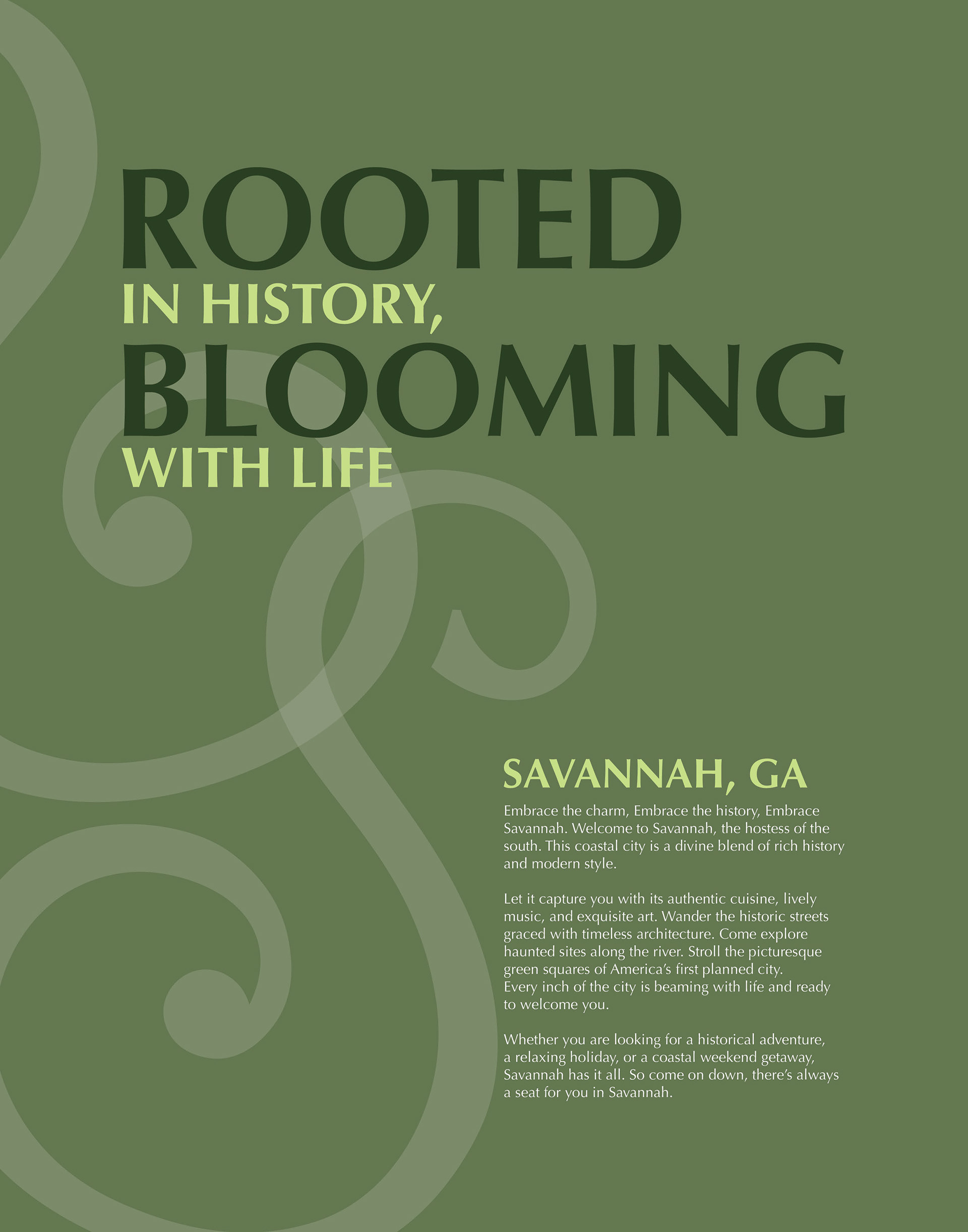
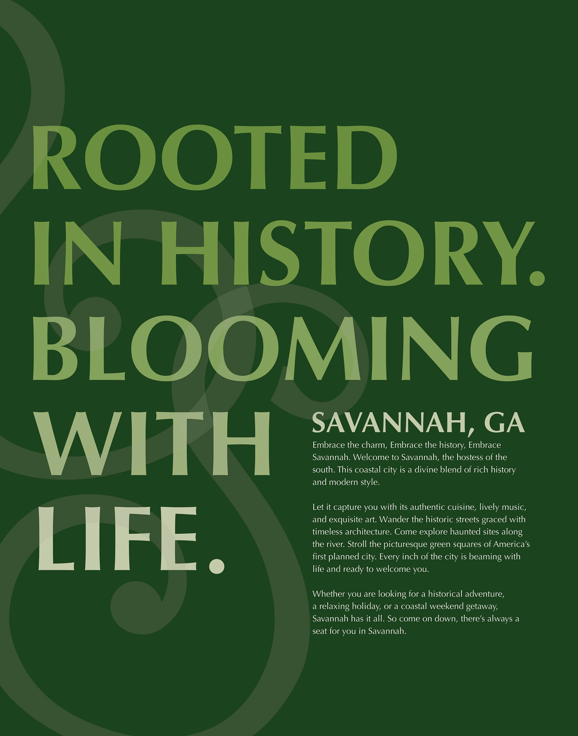
So I switched to a more monochromatic style focusing on that warm summer air color scheme and the more mossy deep earthy green color scheme separately. I ended up selecting the green scheme as I felt it better captured that classy elegant vibe I was going for.
Using my letterform intertwined together created this really lovely visual element that's reminiscent of the ironwork found in Savannah.
For the final poster, I decided to make the headline much larger than the initial iterations. The wording was bold and creative and became the centerpiece of the work.
Final Poster Design
